
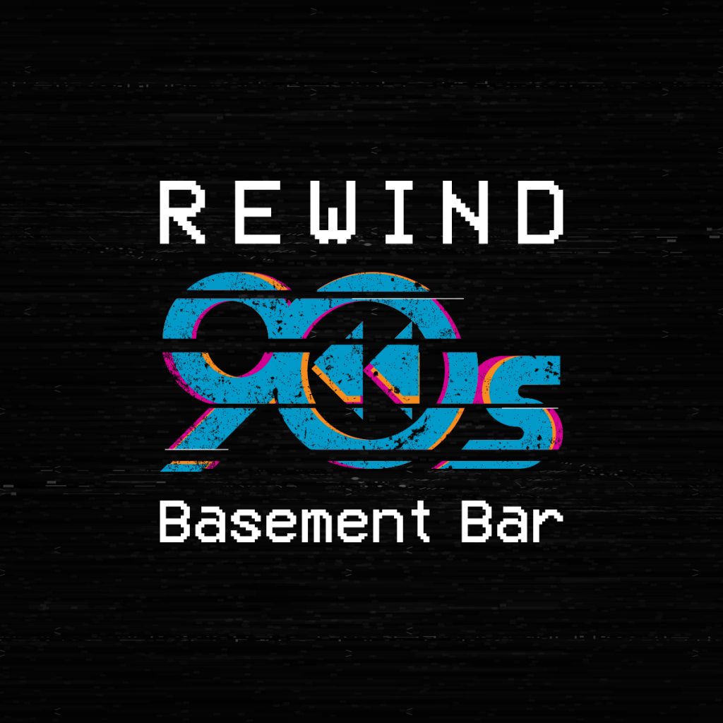
An existing client of mine recently approached me with an exciting challenge. They were expanding their business to encompass a new venture and needed a logo to reflect this exciting development. The brief was clear and concise: they envisioned a logo that captured the essence of a classic TV while incorporating a rewind symbol and a subtle nod to the 90s aesthetic.
To achieve that nostalgic 90s vibe, I chose a vibrant color palette, bursting with the energy that defined that era. I employed a scanline graphic style. This design technique, characterized by the use of horizontal lines to simulate the way old VHS tapes displayed an image on screen, perfectly encapsulated the vintage television theme the client desired.
The creative process was swift and productive. Within a week, I had transformed their vision into a polished logo design. I delivered the final logo in a range of file formats, ensuring it would seamlessly integrate across all their marketing materials, both digital and physical.
The final product was a logo that not only evoked a sense of nostalgia for the 90s but also effectively communicated the essence of the client’s expanding business. It was a perfect example of how design can be used to bridge the past and present, creating a brand identity that is both memorable and representative of the exciting new chapter the client was embarking on.