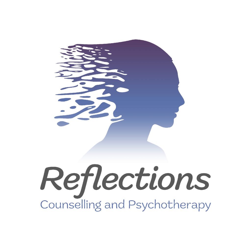
Recently, I had the pleasure of collaborating with an old colleague, a therapist venturing into private practice. They were looking for a logo that not only captured the essence of their profession but also subtly referenced the use of the reflections name.
The challenge lay in creating a logo that was both professional and approachable. After all, therapy is a journey of self-discovery, and the logo should feel welcoming to potential clients. We brainstormed various concepts, finally landing on a design that incorporated the following elements: a silhouette shape of a head and hair that resembles the ripples created when a stone is dropped in water. These lines symbolized the act of reflection, a crucial aspect of the therapist’s approach. The colour palette played a significant role. We opted for soothing purples, colors often associated with trust, tranquility, and healing. This choice aimed to create a sense of security and hope for potential clients.
The final logo was a minimalist yet impactful design. It conveyed the therapist’s focus on self-exploration and growth through reflection, while maintaining a professional and approachable aesthetic.
Get in touch to discuss your new logo TODAY! design@neilmcnally.co.uk


